Skia Template Reference
This page lists the fields supported by license plate Skia templates. You do not need to memorize it to make a simple plate. Use it when you want to check a field name or build a more detailed layout.
File Shape
A license plate template is a JSON file, usually named like this:
licensePlate-default.sktemplate.json
my_license_plate.sktemplate.json
The common top-level shape is:
{
  "name": "my_license_plate",
  "version": 3,
  "type": "licenseplate",
  "vars": {},
  "format": {
    "30-15": {
      "size": [512, 256],
      "background": "vehicles/common/licenseplates/my_license_plate/my_license_plate_background_d.png",
      "root": { "children": [] }
    }
  }
}
Top-Level Fields
| Field | Type | Description |
|---|---|---|
name |
string | Human-readable internal name for the design. |
version |
number | Use 3 for the Skia template system. |
type |
string | Use licenseplate for license plates. |
vars |
object | Variables used to generate text and replace {tokens} in text nodes. |
format |
object | Plate format entries, keyed by format code such as 30-15 or 52-11. |
logic |
string | Optional Lua require path for scripted logic. |
Variables
vars.plate controls generated plate text:
| Field | Type | Description |
|---|---|---|
type |
string | Describes the type of the text content. Usually “string”. |
default |
string or array | Pattern used for generated text. Arrays pick one entry. |
charsets |
object | Token definitions. Values can be strings or arrays of strings. |
formats |
object | Optional per-format default overrides. |
minLength |
number | Minimum custom text length expected by the design. |
maxLength |
number | Maximum custom text length expected by the design. |
Other variables can use preset:
"vars": {
  "stickerColor": {
    "preset": ["#2b6cff", "#24a148", "#f1c21b"]
  }
}
The selected preset stays stable for the same plate text.
Format Fields
Each format entry describes one physical plate size and its layout.
| Field | Type | Description |
|---|---|---|
size |
array or object | Plate render size. Prefer [width, height]. Object form { "x": 512, "y": 256 } is also accepted. |
background |
string | Background color or image path. |
normal |
string | Optional normal map image for the frame or background. |
emboss |
number | Strength of generated foreground embossing in the normal map. |
finish |
object | PBR finish defaults for base and foreground. |
maps |
array | Optional map list. Diffuse is always produced. Use entries such as normal, specular, roughness, metallic. |
limit |
number | First text split length for {line1}. |
limit2 |
number | Second text split length for {line2}. |
segments |
array | Arbitrary text splits. Each entry is [start, end], zero-based, end-exclusive. |
root |
object | Root node of the layout tree. |
finish supports:
| Field | Description |
|---|---|
roughness |
Roughness value for the base plate surface. |
metallic |
Metallic value for the base plate surface. |
fgRoughness |
Roughness value for foreground elements such as text and badges. |
fgMetallic |
Metallic value for foreground elements. |
Node Types
A node can be a group, text, box, image, svg, or path.
{
  "type": "text",
  "name": "plate",
  "text": "{plate}",
  "font": "plate",
  "fontSize": 92,
  "color": "#000000",
  "style": { "width": "90%", "height": 100 }
}
type can be omitted in simple cases. The renderer can infer a text node from text, an image node from src, a path node from path, and a box node from color or gradient.
Common Node Fields
| Field | Type | Description |
|---|---|---|
type |
string | group, box, text, image, svg, or path. container, rect, label, and img are also accepted aliases. |
name |
string | Optional node name. Required if Lua logic needs to patch this node. |
style |
object | Flex layout properties. |
children |
array | Child nodes. |
transform |
object | Visual transform applied after layout. |
blendMode |
string | Blend mode used when painting this node. |
layer |
string | Route node drawing to normal, roughness, or metallic only. |
metallic |
number | Per-node metallic override, from 0 to 1. |
roughness |
number | Per-node roughness override, from 0 to 1. |
shadow |
object | Drop shadow. |
Text Nodes
| Field | Type | Description |
|---|---|---|
text |
string | Text to draw. {tokens} are replaced before rendering. |
font |
string | Built-in font name, font file path, or BMFont JSON path. |
fontAtlas |
string | Atlas image path for BMFont JSON fonts. |
fontNormalAtlas |
string | Optional glyph normal map atlas. |
fontSize |
number | Text size in pixels. |
fit |
string | Use shrink to reduce text size when it would overflow. |
textAlign |
string | left, start, right, end, or justify. Default is centered. |
letterSpacing |
number | Extra spacing between characters. |
anchorX |
number | Normalized horizontal anchor inside the node rectangle. |
anchorBias |
number | Which part of the text width sits on anchorX: 0 left, 0.5 center, 1 right. |
atlasYOffset |
number | Extra vertical atlas offset for BMFont glyphs. Useful for alternate atlas rows. |
color |
string | Text fill color. |
gradient |
object | Optional text fill gradient. |
Box Nodes
| Field | Type | Description |
|---|---|---|
color |
string | Fill color. |
gradient |
object | Fill gradient. |
stroke |
string | Stroke color. |
strokeWidth |
number | Stroke width in pixels. |
radius |
number or string | Rounded corner radius. A percent value like 50% makes circles or pills. |
Image, Svg, And Path Nodes
| Node Type | Field | Description |
|---|---|---|
image |
src |
Raster image path, such as PNG or WebP. |
svg |
src |
SVG asset path. |
path |
path |
Inline SVG path data. |
path |
color or gradient |
Fill for the path. |
path |
stroke and strokeWidth |
Optional path stroke. |
Prefer PNG or WebP images for plate artwork.
Layout Style
style uses flexbox-style layout properties. Numbers are pixels unless the value is a percent string such as "50%".
Direction and alignment:
flexDirection:row,row-reverse,column,column-reverse.justifyContent:flex-start,center,flex-end,space-between,space-around,space-evenly.alignItems,alignSelf,alignContent:auto,flex-start,center,flex-end,stretch,baseline,space-between,space-around.flexWrap:nowrap,wrap,wrap-reverse.
Sizing:
width,height.minWidth,minHeight.maxWidth,maxHeight.flex,flexGrow,flexShrink,flexBasis,aspectRatio.
Position and spacing:
position:relative,absolute, orstatic.left,right,top,bottom,start,end.margin,marginLeft,marginRight,marginTop,marginBottom,marginStart,marginEnd,marginHorizontal,marginVertical.padding,paddingLeft,paddingRight,paddingTop,paddingBottom,paddingStart,paddingEnd,paddingHorizontal,paddingVertical.border,borderLeft,borderRight,borderTop,borderBottom,borderStart,borderEnd,borderHorizontal,borderVertical.gap,rowGap,columnGap.
Other layout fields:
display:flexornone.overflow:visible,hidden, orscroll.
Transforms
Transforms are visual only. They do not change layout.
"transform": {
  "rotate": 5,
  "scaleX": 0.95,
  "scaleY": 1.0,
  "translateX": 0,
  "translateY": 2
}
Supported fields are rotate, scaleX, scaleY, translateX, and translateY.
Gradients
A gradient needs at least two color stops:
"gradient": {
  "angle": 90,
  "stops": [
    { "offset": 0.0, "color": "#ffffff" },
    { "offset": 1.0, "color": "#cccccc" }
  ]
}
Use "radial": true for a radial gradient.
Shadows
"shadow": {
  "color": "#00000080",
  "blur": 6,
  "dx": 0,
  "dy": 2
}
A shadow is drawn under the node content.
Blend Modes
Supported blend modes are:
multiplyscreenoverlaydarkenlightenaddorplussrc-insrc-atopdestination-inordst-indestination-outordst-outxor
If blendMode is missing or unknown, the node uses normal source-over painting.
Colors
Supported color formats include:
#rgb#rrggbb#rrggbbaargb(r,g,b)rgb(r,g,b,a)white,black,red,green,blue,yellow,gray,grey,transparent
Fonts
You can draw text in three ways:
- Use a built-in atlas font name, such as
plate. - Point
fontto a vector font file. - Point
fontto a BMFont JSON layout and setfontAtlasto the matching atlas image.
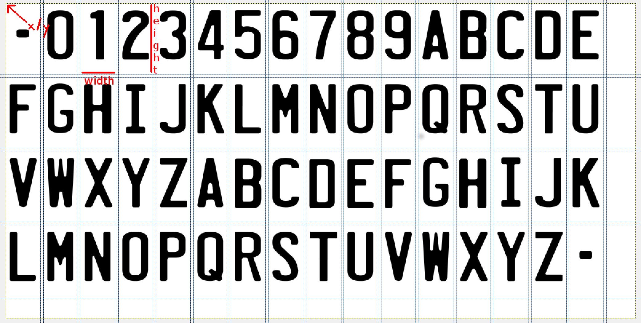
For a custom plate font, create or copy a platefont.json file and make sure it matches your atlas image. You can start from this plate font template
.
The important part of a BMFont file is the chars list. Each character points to a rectangle in the atlas.
"chars": {
  "count": "64",
  "char": {
    "id": "45",
    "x": "0",
    "y": "0",
    "width": "56",
    "height": "115",
    "xoffset": "0",
    "yoffset": "0",
    "xadvance": "56",
    "page": "0",
    "chnl": "15"
  }
}
idis the character code.xandyare the top-left pixel position in the atlas.widthandheightare the size of the glyph in the atlas.xoffset,yoffset, andxadvancecontrol placement and spacing.
Adding A New Plate Format
A new physical plate format needs more than a template. You need a new mesh, material, and fallback license plate files.
Put the shared files in a folder like:
/vehicles/common/licenseplates/%NEW_FORMAT%/
or, for a map-specific default:
/vehicles/common/licenseplates/%NEW_MAP%/
The material name should follow this convention:
licenseplate-WIDTH-HEIGHT
Use the width and height in centimetres. Add a one or two letter country code only when a similar format already exists and needs a separate material.
You also need a default styling so maps or designs that do not define your new format still show a plate instead of a missing texture. The fallback template path should be:
/vehicles/common/licenseplates/default/licensePlate-default-%NEW_FORMAT%.sktemplate.json
Was this article helpful?