Interface
Tool window layout
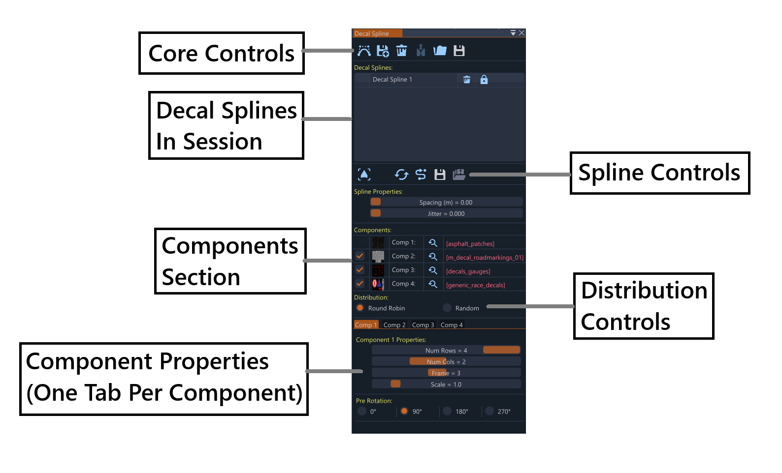
Main Tool Controls Section
The top row contains core operations:
- Add New Decal Spline: Creates a new decal spline in the scene. The mouse cursor changes to purple, allowing the user to click on the map to place nodes and draw the decal path
- Import Decal Splines from PNG Mask: Loads splines from exported PNG mask files. Useful for importing previously created decal layouts or sharing decal arrangements between sessions
- Remove All Decal Splines: Clears all decal splines from the session. This action cannot be undone
- Toggle Rigid Translation/Lock Button: Switches between free and rigid translation (locked) modes. Free mode allows normal movement, while locked mode prevents accidental spline modifications
- Export Decal Splines in Session to PNG Mask: Exports the current session to a PNG mask file, useful for sharing decal layouts or backing up work
- Save the Decal State of the Session to File: Bakes the decals into the scene so they load with the level. This permanently saves the decal arrangement to the map file
Decal Splines Section
Spline List
- Session Management: Lists all decal splines in the current session
- Individual Controls: Each spline row contains:
- Remove Decal Spline Button: Deletes the specific spline
- Enable/Disable Toggle: Controls whether the spline is active
Spline Operations Section
These buttons operate on the selected spline (highlighted in the list):
- Go to Spline: Moves the camera to focus on the selected spline, useful for navigating to distant decal arrangements
- Split Spline: Divides the spline at the selected node, creating two separate decal splines
- Flip Spline: Reverses the spline direction (back to front), which also flips the decal orientation
- Simplify Spline: Reduces node count while preserving spline shape, useful for cleaning up complex decal paths
- Save Selected Spline Profile to Disk: Exports the selected spline’s properties to disk (creates .json file), including component settings and distribution preferences
- Load Profile from Disk: Imports a profile from disk and applies it to the selected decal spline, restoring all component and distribution settings
Properties Section
Two sliders control the core spline behavior:
- Spacing: Distance between decal instances along the spline. Smaller values create denser decal placement, larger values create more spread-out arrangements
- Jitter: Random Z-axis rotation variation for decal orientation. Higher values create more varied, natural-looking decal orientations
Components Section
Lists all available components (1, 2, 3, 4) with individual controls:
Component Rows
Each component has its own row containing:
- Enable Checkbox: Controls whether the component is active (except Component 1, which is always enabled)
- Thumbnail Image: Small preview of the component’s appearance, helping to identify materials at a glance
- Component Label: Shows “Comp1”, “Comp2”, “Comp3”, or “Comp4”
- Material Selection Button: Opens the material selector for that component, allowing the user to browse and select different decal materials
- Material Path Display: Shows the file path of the selected material for that component, useful for tracking which materials are assigned
Distribution Section
Controls how decals are distributed along the spline:
- Round Robin: Cycles through components sequentially, placing one of each enabled component in order before repeating. Creates a predictable, repeating pattern
- Random: Uses weighted probabilistic placement where each component has a chance to be selected based on its individual weight value. Creates more natural, varied arrangements
Tab System
Dynamic tabs are created for each enabled component (maximum of 4 tabs):
Component Tab Contents
Each tab contains the same set of controls for its respective component:
Tiled Decal Properties
- Num Rows Slider: Controls the number of rows in the decal grid. Higher values create taller decal arrangements
- Num Cols Slider: Controls the number of columns in the decal grid. Higher values create wider decal arrangements
- Frame Slider: Selects which frame to display from the decal texture, useful for animated or multi-frame decals
- Scale Slider: Adjusts the size of the decal instances. Larger values create bigger decals, smaller values create more subtle effects
Orientation Control
- Pre-rotation Radio Button: Sets the Z-axis rotation (0°, 90°, 180°, 270°), allowing control over decal orientation
Each tab provides identical functionality, allowing independent control of each enabled component’s tiled decal properties and orientation.
Material Selection Window
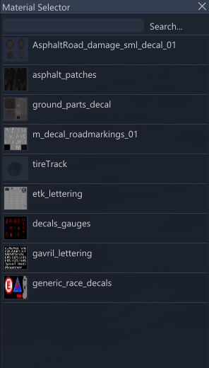
The Material Selection Window provides access to all available material assets for decal components:
Search and Navigation
- Search Bar: Find specific materials by name, useful for quickly locating particular decal textures
- Browse Functions: Navigate through material collections, organized by category and type
Material Library
- File Format: All materials use standard material formats which are compatible with the decal system
- Organized Collections: Browse through material categories and collections, making it easy to find appropriate decals for different purposes
Last modified:
September 15, 2025
Was this article helpful?